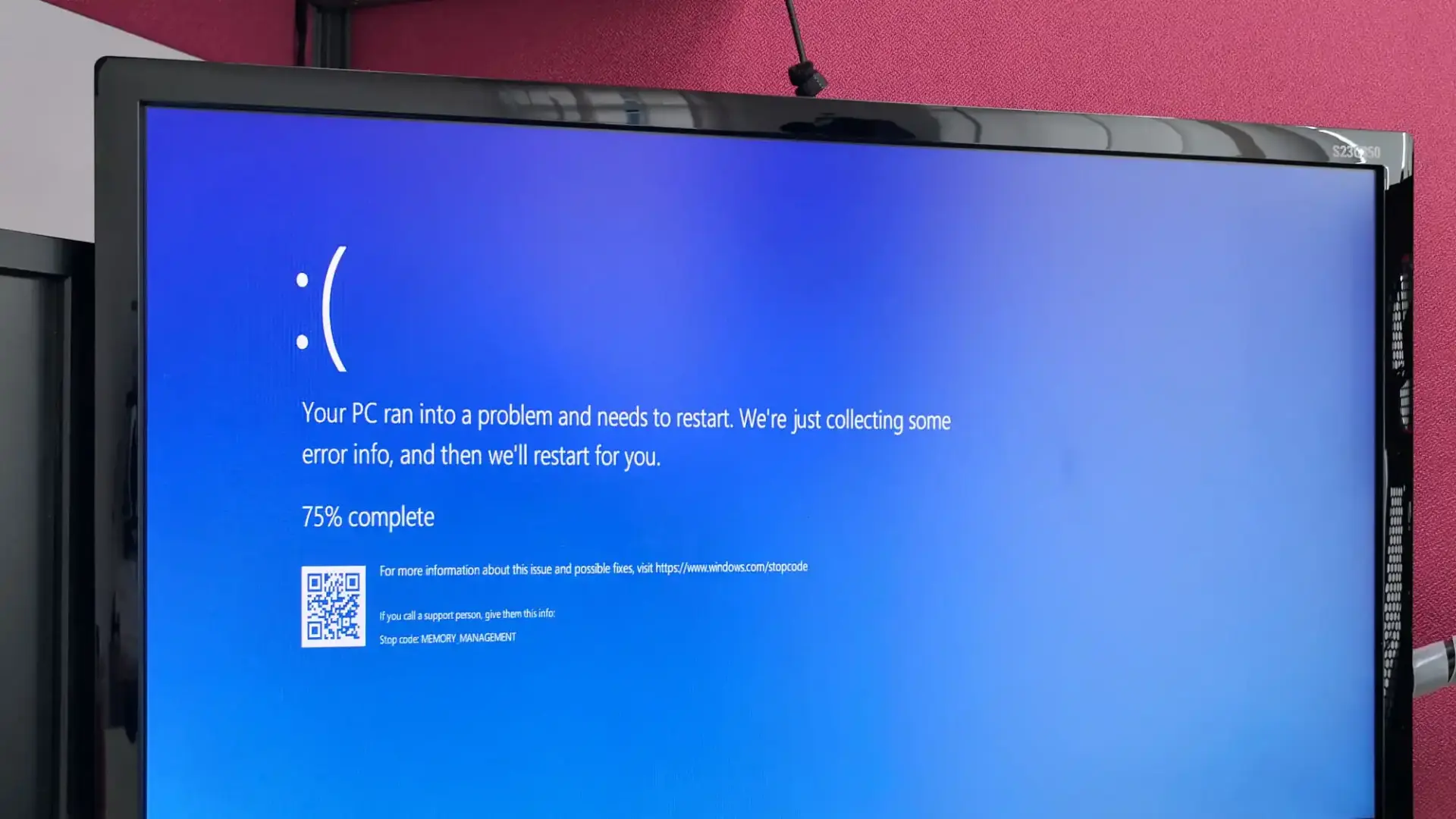
For decades, it has been the digital equivalent of a gut punch for Windows users: the dreaded Blue Screen of Death (BSOD). This stark blue screen, appearing when your computer encounters a critical error, has been both a source of frustration and a strange, almost nostalgic icon of the PC era. But now, after years of its reign, Microsoft appears to be ushering in a new era, potentially retiring the iconic blue hue for something entirely different. Are you ready for a change?
For many, the sight of the blue screen accompanied by cryptic white text meant unsaved work, interrupted games, and the looming task of troubleshooting. It was a digital roadblock, often appearing at the most inconvenient times. The BSOD, officially known as a “Stop Error,” signaled that Windows had encountered a problem so severe it had to shut down to prevent further damage. While the information displayed was intended for IT professionals and offered clues about the cause of the crash, for the average user, it often felt like an alien language.
The first iteration of the BSOD appeared way back in Windows 1.0, a far cry from the version many remember. Over the years, it evolved, gaining the now-familiar blue background and eventually the sad emoticon in Windows 8, a touch of digital empathy in a moment of crisis. Even a QR code was added later to help users find more information online. These small additions attempted to soften the blow, but the underlying feeling of system failure remained.
Now, in a move that has caught many off guard, Microsoft is testing a significant visual overhaul of this infamous screen. According to recent reports and insights from the Windows Insider program, the blue might be gone for good. Instead, early testers are encountering a screen with a different dominant color. While initial reports suggested a shift to black, mirroring the appearance of update screens, the color currently being previewed with Windows Insiders is reportedly green.
Yes, you read that right. Green. The color of go, the color of nature, and potentially, the new color of system crashes in Windows.
Microsoft has officially acknowledged this change, stating that the new design is “more streamlined” and “better aligns with Windows 11 design principles.” The company aims to get users back to productivity as quickly as possible, even when things go wrong. This new approach seems to prioritize a cleaner, less alarming visual experience.
So, what exactly does this new “Green Screen of Death” (GSOD) look like? Based on information from Windows Insider builds, the new screen appears to be simpler. The frowning face and the QR code are reportedly gone. Instead, users are greeted with a straightforward message: “Your device ran into a problem, and needs to restart.” This is accompanied by a progress indicator showing the percentage of the restart process. At the bottom, the crucial “Stop Code” and the name of the failing component are still present, providing essential information for troubleshooting.
The reasons behind this color change are multifaceted. Microsoft has been on a design refresh journey across its products, aiming for a more unified and modern look. The shift away from the classic blue aligns with this broader design language, potentially bringing the error screen in line with the overall aesthetic of Windows 11.
Interestingly, this isn’t the first time Microsoft has experimented with the color of the BSOD. Older versions of Windows, like Windows NT, Windows 8, and even early Windows 11 builds, had black error screens. The current green being tested could be another experiment, or it might be the final choice for the public release. Only time will tell which color Microsoft ultimately settles on.
The reaction to this news has been varied. Some users express a sense of nostalgia for the blue screen, seeing it as an old friend, albeit one that brings bad news. Others welcome the change, hoping the new design will feel less jarring and more informative. The removal of the sad face, in particular, has been a point of discussion, with some finding it amusing and others considering it unnecessary.
For everyday users, the core functionality of the error screen remains the same. It still indicates a critical system failure requiring a restart. The underlying causes of these errors – hardware issues, driver conflicts, or software bugs – are not magically disappearing with a change in color. Therefore, understanding the Stop Code and being prepared to troubleshoot remains crucial.
This visual update is currently rolling out to Windows Insiders on the Beta, Dev, and Canary channels as part of Windows 11 version 24H2. Microsoft has not yet announced when this change will reach the stable, public version of Windows 11. It’s possible that the design could evolve further based on feedback from testers.
While the color and some visual elements are changing, the fundamental purpose of the error screen endures. It serves as a critical indicator of system instability, prompting a necessary restart to prevent further issues. Whether it’s blue, green, or another color entirely, the appearance of this screen should still be taken seriously.
So, what does this mean for you? For now, if you’re not a Windows Insider, you’ll likely continue to see the familiar blue screen when a critical error occurs. But in the near future, be prepared to potentially encounter a green screen instead. It’s a significant visual departure from a long-standing symbol of Windows, and it signifies Microsoft’s ongoing efforts to modernize and refine the user experience, even in moments of system failure.
The question remains: will this new color evoke the same sense of dread or will it feel like a fresh start, even when things go wrong? Only time and user experience will tell. One thing is certain: the digital landscape is constantly evolving, and even the most iconic elements are subject to change. So, get ready to potentially say goodbye to the blue and hello to a new color in the world of Windows errors. It’s a new chapter for a screen that has been a constant companion for PC users for decades.


