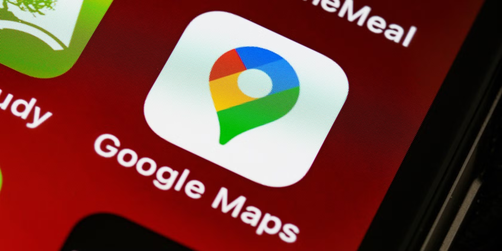
The familiar Google Maps interface has just undergone a small—but interesting—makeover. If you’ve opened the app recently on your Android or iOS device, you might’ve noticed something a bit different tucked away in the bottom corner of your screen. It’s subtle, easy to miss if you’re not looking closely, but there’s a brand-new logo down there. And while the change might seem cosmetic, it actually hints at something larger happening behind the scenes.
For years, that little four-color “Google” logo sat in the bottom-left corner of the map view, quietly anchoring the display. It’s been a staple, really—a little signature mark that didn’t need to shout. But in recent weeks, Google has swapped it out for something a bit cleaner: a monochrome “Google Maps” wordmark, now appearing in black or white text depending on whether your device is in light or dark mode.
A Subtle Yet Strategic Design Shift
At first glance, it may not seem like much. But this update feels pretty intentional. The classic multicolor logo, while iconic, could sometimes feel a tad loud, especially when you’re in fullscreen mode trying to focus on the map itself. By comparison, the new “Google Maps” label is almost whisper-quiet. It’s there, but it doesn’t pull attention away from what matters.
Abner Li over at 9to5Google called it “somewhat less distracting than the four-color version,” and that sounds about right. The core functionality of the app—showing you where you’re going—takes center stage. It’s not a reinvention, but it’s a nice touch.
Widespread Rollout on Mobile Platforms
This isn’t a limited test, either. The updated logo has now made its way to most Android and iOS devices. Specifically, Android version 25.21 and iOS version 25.22 of the app both feature the new look. However, the web version of Google Maps hasn’t caught up just yet, so you won’t see the change on desktop.
That kind of staggered rollout is pretty typical for Google. Mobile usually gets the first pass, especially considering how many of us rely on our phones for navigation these days. Desktop updates often follow, but sometimes at their own pace.
Part of a Larger Evolution
It’s worth noting: this isn’t an isolated tweak. The logo refresh is just one piece of a bigger puzzle. Google Maps has been quietly reinventing itself over the past couple of years, trying to modernize both how it looks and how it feels to use.
Back in July 2024, Android users saw the debut of a new “sheet-based” design, which eventually made its way to iOS in March 2025. This interface brings up a sliding sheet from the bottom of the screen for things like route details and place information, letting the main map stay visible the whole time. It’s a thoughtful approach, honestly. You don’t lose context while you browse, and the rounded corners and softer visual elements help it all feel a little more fluid.
Google’s also added some smart features geared toward summer travel—curated lists, personalized recommendations, and even some AI-powered insights to help people discover new spots. All these updates suggest that Google wants Maps to be more than just a turn-by-turn navigator. It’s evolving into a fuller travel companion.
The Purpose Behind the Changes
Zooming out a bit, this gradual simplification of design seems to be part of a broader software trend. Many tech platforms are dialing back the visual clutter. For Google, the switch from a multicolor “Google” logo to a text-based “Google Maps” wordmark seems to echo that direction—making sure users stay focused on what they opened the app to do.
It also subtly reinforces brand identity. Instead of just the generic “Google” label, the app now spells out exactly which part of the Google ecosystem you’re interacting with. That might help with clarity, especially for users juggling multiple Google apps.
Plus, adapting the logo color to match your device’s theme is a small but meaningful touch. It makes the app feel more in sync with the rest of your phone, which is the kind of detail that often goes unnoticed—until it doesn’t.
In the grand scheme of things, a logo change might not seem like a headline moment. But it does serve as a quiet reminder: Google Maps, like many of the apps we use every day, is constantly being tweaked, refined, and rethought. Sometimes the changes are big and splashy. Other times, like this, they’re more about tightening the screws and polishing the edges.
Either way, it all adds up. And for the millions of us who rely on Google Maps daily, these small enhancements keep the experience feeling fresh and, hopefully, a little more helpful with each update. So if you haven’t noticed the new corner logo yet, take a look. It’s a small thing, but it’s part of something bigger.


