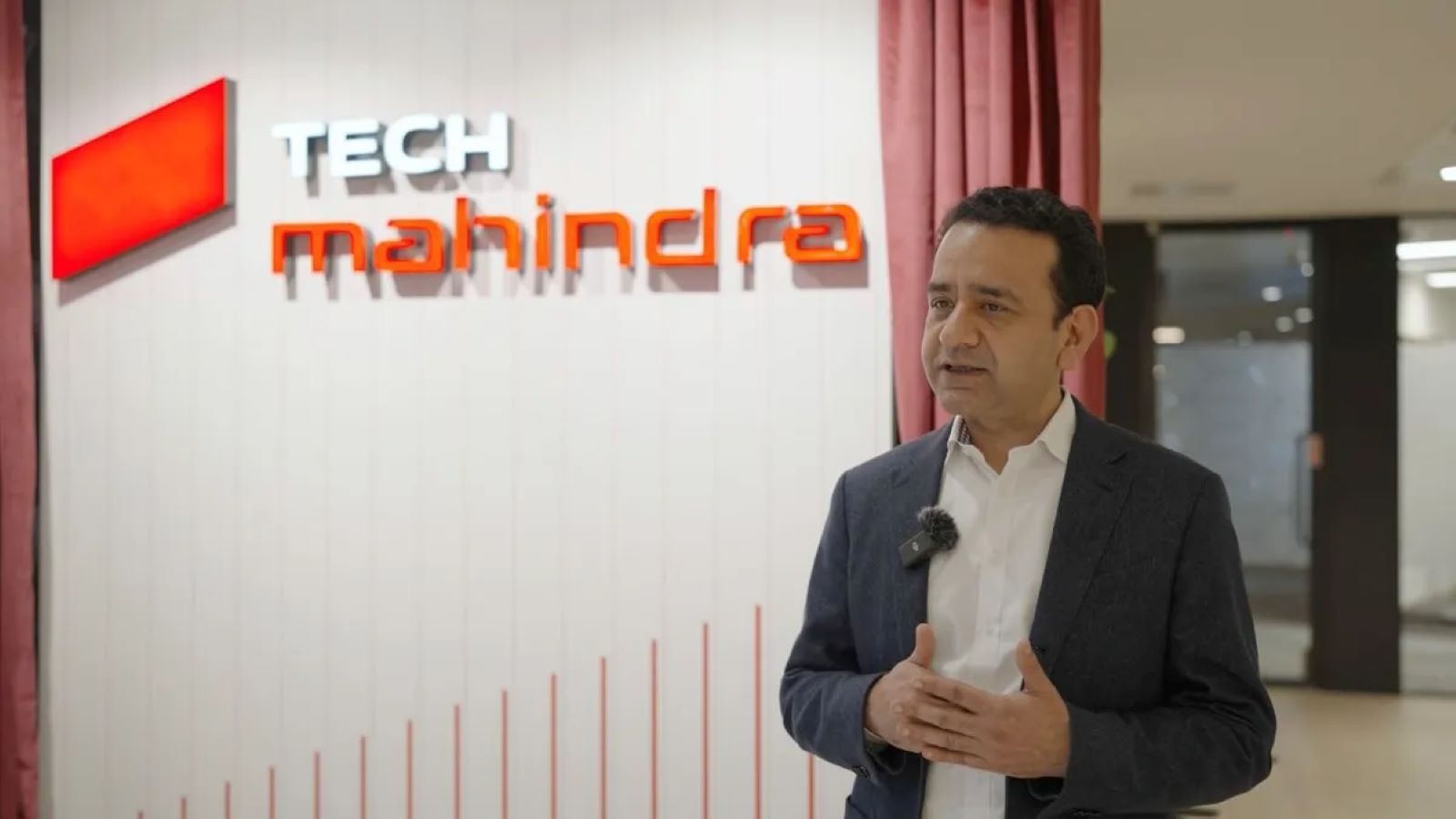
Technology solutions provider Tech Mahindra (NSE: TECHM) marked its 39th anniversary with the unveiling of a refreshed brand identity, signaling a clear shift toward an AI-led future and digital reinvention. The update features a modern visual design and the introduction of a distinct ‘lozenge’ symbol, reflecting the company’s focus on innovation and agility. This step is part of a broader three-year strategic roadmap aimed at positioning Tech Mahindra as a progressive global partner that can truly ‘Scale at Speed’.
Key Takeaways
- Tech Mahindra introduced a refreshed brand identity to align with the AI and digital reinvention era.
- A new ‘lozenge’ symbol represents focus, precision, and ambition.
- The lozenge reinterprets the Mahindra Group’s iconic ‘Rise’ beam in a dynamic way.
- The visual language keeps the signature Mahindra Red but adds a more contemporary global palette.
- The change strengthens brand recognition, unifies teams worldwide, and reinforces Tech Mahindra’s role as a future-ready partner.
Mohit Joshi, CEO and Managing Director of Tech Mahindra, shared that this refresh pays tribute to the company’s long-standing legacy of trust while setting the tone for its next phase of growth in the AI era. It’s both a nod to where the company has come from and a statement about where it’s heading.
Focusing on Clarity and Cohesion
This refreshed identity is more than a design update. It’s a unifying framework meant to bring clarity and cohesion across all customer interactions and internal communications. It also helps integrate the company’s diverse portfolio businesses under one strong, recognizable brand.
The new look captures what Tech Mahindra stands for today: agility, collaboration, and discernment in an era defined by rapid change. By modernizing its visual expression, the company aims to stay relevant in a competitive digital landscape while also becoming a more attractive employer for global talent.
At the heart of this new identity lies the ‘lozenge’ symbol. Compact yet dynamic, it captures Tech Mahindra’s distinct place within the larger Mahindra ecosystem. Anchored in the recognizable Mahindra Red and balanced by modern complementary colors, the design forms a cohesive visual system that can adapt seamlessly across all platforms and regions.
Peeyush Dubey, Chief Marketing Officer at Tech Mahindra, noted that the goal wasn’t to rewrite the company’s story but to refine its focus. Extensive research showed that customers deeply trust both the Tech Mahindra name and the Mahindra heritage. The refreshed identity now conveys that the company is not just prepared for the future but built to deliver value with speed and precision. This renewed clarity is expected to align global teams and spark higher performance across the organization.
Ultimately, the brand evolution revolves around four main goals. First, to boost brand saliency and recall in a crowded digital services market. Second, to reinforce Tech Mahindra’s position as a trusted digital transformation partner. Third, to instill a renewed sense of pride and belonging among its global workforce. And finally, to present a unified, modern identity that reflects the company’s global reach and technological depth.
As Tech Mahindra celebrates nearly four decades of service, this brand refresh represents more than just a visual shift. It’s a signal of readiness for the next wave of technology-driven transformation, where AI will play a defining role in shaping both business and human progress.
Related FAQs
Q: Why did Tech Mahindra change its brand identity?
A: Tech Mahindra refreshed its brand identity to mark its 39th anniversary and to clearly position itself for the future, especially in the context of rapid AI-led digital change and transformation.
Q: What is the ‘lozenge’ symbol in the new brand?
A: The ‘lozenge’ is a new, distinctive symbol at the heart of the updated visual identity. It is a modern, dynamic interpretation of the Mahindra Group’s ‘Rise’ beam and represents focused energy, precision, and the company’s ambition.
Q: What is the main focus of Tech Mahindra’s refreshed brand philosophy?
A: The main focus is to reinforce its positioning as a future-ready digital and technology consulting partner, signaling its ability to help global enterprises operate at ‘Scale at Speed’ in the AI era.
Q: Is Tech Mahindra changing its logo completely?
A: The company is unveiling a refreshed brand identity, which includes a modern visual language, a new ‘lozenge’ symbol, and an updated color palette, while still retaining the core Mahindra Red and the existing brand name.


