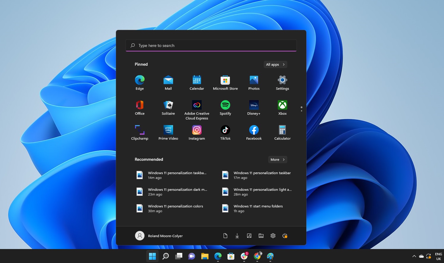
Microsoft is shaking things up in the Dev Channel with a substantial update to the Windows 11 Start menu. The changes, which many users first spotted in April preview builds and were confirmed in May, aim to overhaul the way we navigate our desktops. Among the most notable updates? A scrollable interface, dynamic scaling across devices, and deeper customization tools. It’s a clear response to long-standing feedback about the Start menu’s limitations—and a move toward a more fluid, adaptable user experience.
Key Takeaways:
- The Start menu now supports a scrollable view for easier navigation.
- Layout adapts dynamically to screen size, displaying more content on larger displays.
- Users can turn off the “Recommended” section to declutter their menu.
- Two new views—Category and Grid—offer different ways to arrange apps.
- A new “Phone Link” shortcut improves mobile integration.
- Lock screen widgets can now be customized and reorganized.
- Gamepad keyboard support enables PIN sign-in with a controller.
For years, the Windows Start menu has been that go-to launchpad for apps, files, and system settings. With Windows 11, Microsoft tried to simplify things—but that minimalism didn’t land well with everyone. The old layout, which split “Pinned” and “All Apps” into separate areas, meant extra clicks and a bit too much bouncing around. With this new update, Microsoft is clearly trying to tighten the experience, making it easier—and honestly, more pleasant—to get to what you need.
A Single, Scrollable View for All Your Apps
Probably the first thing you’ll notice is the scrollable layout. Gone are the days of hopping between separate sections just to find that one app buried in your list. Now, it’s all right there in one place. You scroll, you find, you launch. Simple.
This also saves time for users juggling lots of apps. Instead of clicking back and forth, the full app list lives within the main menu. It may seem like a small shift, but it genuinely changes the rhythm of how you use your desktop.
What’s more, the Start menu now scales based on your display size. On a large screen? You might see up to eight columns of pinned apps, six recommended items, and four category columns. On a smaller device, the layout shrinks accordingly—six pinned, four recommendations, three categories. It’s smart scaling, basically, and it makes the interface feel like it belongs, no matter what device you’re on.
Control Over Your Digital Space: New Customization Options
Customization gets a meaningful boost, too. One of the more satisfying changes is the ability to disable the “Recommended” section. That part of the menu has always been divisive—it shows your recent files and apps, which some find helpful, but others just see it as digital clutter. Now, if you’re in the latter camp, you can just turn it off.
With that gone, there’s more room for what matters: your pinned apps. And the visual simplicity that comes with a cleaner Start menu shouldn’t be underestimated. It just feels better.
Two fresh layout modes round out the personalization options. “Category View” groups apps by type, much like you see in app stores or mobile libraries. Think: Productivity, Entertainment, and so on. Then there’s “Grid View,” which organizes everything alphabetically but spreads it out more visually across the screen. Importantly, Windows remembers your preference, so whichever view you choose will stick the next time you open the menu.
Connecting Your Devices: Phone Link Integration
Another thoughtful touch: the new “Phone Link” button, tucked right next to the Search bar. It’s a small addition, but it has big implications for cross-device use. Whether you’re on Android or iOS, tapping this shortcut brings up tools to manage your connected phone—like messaging, notifications, even transferring files.
You can expand or collapse phone content without digging through menus, which makes bouncing between your desktop and mobile feel a little more seamless. It’s another sign that Microsoft is really leaning into the idea of an interconnected digital ecosystem.
A More Personal Lock Screen and Gaming Access
The lock screen also gets some love. You can now tweak which widgets appear there—adding, removing, or rearranging things like Weather, Sports, Watchlist, and Traffic. It might sound like a small touch, but it helps make even the login experience feel more tailored.
And for gamers or anyone using a handheld PC, there’s a new gamepad keyboard. Basically, it lets you sign in using a controller and a PIN. Handy for devices like the ROG Ally, or really any Xbox-style portable. It’s a niche but welcome feature that shows Microsoft is thinking about the broader landscape of device usage.
The Bigger Picture: A User-Driven Approach
What’s interesting here is that these changes aren’t just surface-level tweaks. They reflect a real effort by Microsoft to listen to its community—especially its Windows Insider testers—and roll out meaningful improvements.
This isn’t about change for change’s sake. It’s about making Windows 11 feel more natural, more adaptable, and ultimately more in tune with how people use their computers today. Scrollable menus, adaptive layouts, and deeper customization all point toward one thing: user control.
For now, the update is limited to the Dev Channel, meaning only early testers are seeing it. But assuming all goes smoothly, these features will make their way to everyone else in the coming months. When they do, the Start menu might finally feel like it’s caught up with the needs—and expectations—of modern users.


